
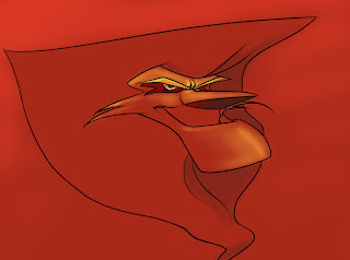
I just randomly felt like doing something in color, just putting it down and seeing what came of it. This is the result. I like somethings about it but I really feel like it could be improved in a lot of ways... color and composition wise. Perhaps a little too saturated? I don't know, color is a skill I'm trying to improve. Helpful hints would be great! Cheers


3 comments:
The colors are nice; the really saturated red of the sky works because it is backed against the more muted red of everything else. I think it's better to opt for more flat brush stroke and colors then that overly soft, airbrushy look.
Also, A lot of things are a bit too paralell: The Tallest tree is the foreground is about the same height as the mountain peak, and a lot of other things are a bit too even as well. Try really changing up the height and width of everything to make it less uniform
wow, Will...ur definitely not shy when it comes to criticism.
I think it looks like the mountain OF DEATH...
looks really great.
Post a Comment